Improving Communauto's Conversion & Retention Through Strategic Mobile UX Redesign
CORE ACHIEVEMENTS:
Information Architecture: Improved structure from 18% to validated success.
Usability Testing: Task completion increased from 40% to 100%.
User Pain Points: Fixed key issues in sign-up, pricing clarity, and bookings.
Market Strategy: Spanish localization validated for audience growth.
ROLE:
End-to-end product design from research through validation.
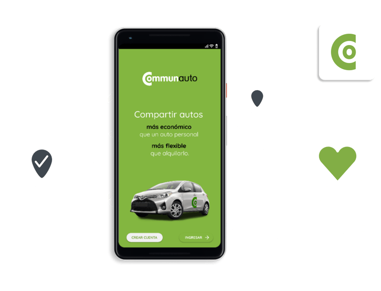
Not long ago, I discovered Communauto in Montreal, the oldest car-sharing service in North America. I was impressed by their eco-friendly mission and strong commitment to creating a positive environmental and social impact in dense urban areas.
However, despite the value they provide, I noticed that user feedback across their Meta page, Reddit, and App Store reviews consistently pointed to issues with the app experience. That gap caught my attention and led me to explore the product as an 8-week case study, following a structured process from research to validation to showcase how I approach complex design challenges.
KEY COMPETENCIES:
User Research & Usability Testing | Information Architecture | Interaction & Visual Design | UX Writing & Content Strategy | Strategic Product Thinking.
Where is the app experience causing friction in conversion?
I needed to understand both the business context and user problems. Without stakeholder access, I used desk research to analyze Communauto's public information, website, and business model through Lean Canvas. Simultaneously, I conducted primary research through surveys and interviews to understand user needs. This dual approach allowed me to identify where business objectives and user needs aligned, and where friction was occurring.
On one hand, Communauto had clear objectives:
they wanted to offer a green, cost-effective mobility solution,
improve their operational efficiency, and,
of course, grow their user base.
On the other hand, users:
needed a reliable, simple, and affordable service.
wanted to sign up quickly,
find a car nearby without hassle, and rent it for short-term use.
Sign-up friction
40% Had Concerns
A notable 40% of users expressed key concerns about the sign-up process, citing security worries around sensitive documents, the invasive amount of personal data required, and frustration with the multi-day waiting period.
" I don't feel safe sending sensitive personal documents."
However, I also discovered that the reality was more complicated for users than it should have been.
Through 11 surveys, 3 interviews, and 150+ app store and social media reviews, I uncovered friction across Usability, Functionality, and Navigation.
Lean Canvas and Journey Mapping highlighted pricing confusion, trust issues, and availability anxieties, while Affinity Diagramming and Value Proposition Canvas revealed opportunities to improve speed, clarity, and trust. Three critical pain points emerged, each ready for a UX redesign.
Pricing plan confusion
25-35% Struggled
Another 25% of users struggled to choose a plan, while 35% found pricing difficult to navigate—mainly because they couldn’t quickly compare the 8 available plans in-app, had to switch to the website, and rely on a non-intuitive calculator.
" Unnecessarily complex pricing plans."
Booking flow inconsistencies
50% Requested Improvements
And 50 % of users reported booking friction, citing confusing map icons, hidden car availability, no demand or alternatives alerts, and limited filtering.
"I wish I had been informed about car availability—it would have helped me plan better instead of just relying on luck on weekends."
Why Focus on the App Experience?
80% Mobile-First Users
Because 80% of users rely on it for bookings, making app improvements key to satisfaction.
Users fall into two groups: practical (focused on convenience and cost) and values-driven (motivated by environmental impact).
Alberto, our "Persona" derived from research, is 25, car-free, books 1–10x/month, and wants fast, economical trips with hassle-free multi-stop errands.
How can I streamline the user flows for sign-up, pricing selection, and vehicle booking in the mobile app?
With a clear problem definition, I applied a creative matrix to brainstorm potential solutions. I then used the Feasibility, Viability, and Desirability Matrix to evaluate and create a prioritized list of features, that balanced user needs with technical and business realities.
Out of the original solutions, 75% were discarded, leaving me with a 25% that would deliver real impact with realistic implementation:
Easy Sign-up
Fewer steps: Use license OCR scanning to speed up data entry.
Access while processing: Let users access some features while documents are being processed, reducing wait times.
Security transparency: Provide alerts about the safety of their personal information.
Intituitive privileges selection rather than a complex fee structures.
Provide helpful suggestions to assist users.
Display a dynamic calculator as user select benefits.
Display all pricing options within mobile experience.
Improved user interface map.
Additional vehicle information in search results to support informed decision-making.
Extra filters to refine search results effectively.
Proactives notifications about upcoming high-demand dates.
Real-time suggestions for vehicle availability
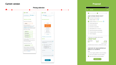
Simplified Subscription Pricing Plan
Enhanced Booking Experience
As I moved forward, I realized that several proposed solutions required a redesign of the information architecture (IA) and the interaction design. Given that Spanish-speaking users were notably represented in the earlier research, I opted to develop the IA and prototype in Spanish to validate localization assumptions early and demonstrate scalability into a new market.
To evaluate the existing IA, I conducted a Tree Test with 10 participants.
The study uncovered critical details:
only 18% of users arrive to the goal,
followed by another 36% who completed 67% of those tasks.
It felt discouraging, but finding issues before building screens saved huge time and effort.


As a result,
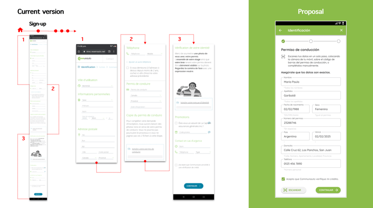
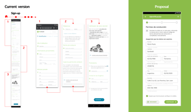
I restructured the entire sign-up process within the app, which previously started on the website.
I simplified the navigation steps for both the first-time onboarding and sing-up processes.
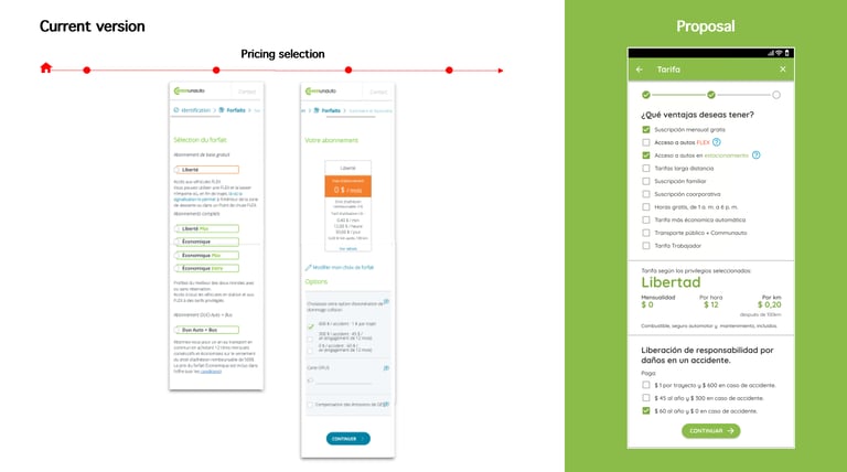
I validated the seleccion of privileges when creating a pricing plan.
I modified the ux wording for clarity and engagement.
The new structure allowed me to create wireframes with a modified layout, including new screens for the sign-up process.
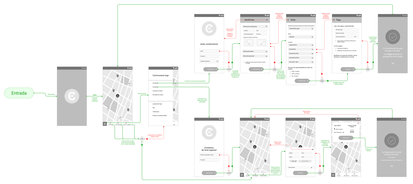
I then mapped a wireflow to represent the three critical user journeys—sign-up, plan selection, and booking and test usability.
🔍 Click or tap the image to view full screen
In the 1st usability round (5 participants) task completion was only 40%
Issue: Booking screens overloaded users → Solution: Show only essential information with an optional expandable detail view.
Issue: Confusing label (“Privilegios”) → Solution: Renamed to “Tarifas” and added helper text to support the benefit selection approach.

Later in the 2nd iteration, users navigated flows more confidently, validating the IA improvements before high-fidelity design.
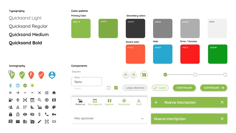
With a validated structure, I moved to the visual design layer. This phase focused on updating the brand and improving the usability, consistency and accessibility of the design system.

I refreshed the logotype Communauto’s reflecting a sense of community, and separately crafted a clean, modular visual identity to strengthen brand consistency.
I build a scalable design system based in Google Material principles and established a component library.
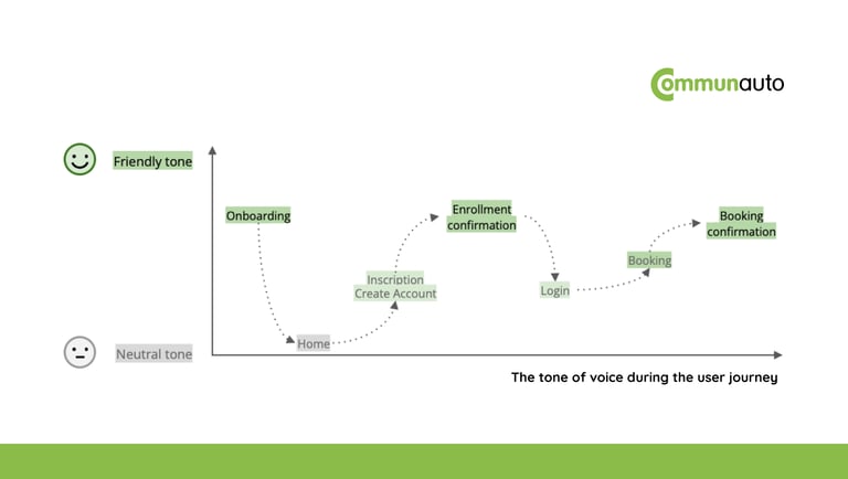
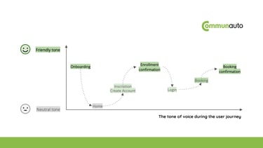
For the UX writing, I adopted a neutral tone to keep users focused, and friendly tone during transition tasks to create a positive atmosphere.
🔍 Click or tap any image to view full screen
At this stage, it was necessary to validate critical design decisions. I developed a high-fidelity prototype and conducted a final usability testing, followed by a heuristic evaluation. After additional adjustments, a "final" version was ready, with enhanced efficiency, effectiveness, and user satisfaction.

Final Usability Testing Round (5 participants - high-fidelity prototype)
100% task completion (5 of 5 participants completed all tasks successfully)
Zero critical errors during navigation or task completion
Qualitative feedback consistently positive about clarity and ease of use
Before & After Comparison
Overall Experience
Before: 25 screens across the three problem areas
After: 18 screens in the redesigned flows
Impact: 28% reduction in screens, simplifying the user journey
Sign-up Flow
Before: Started on website, continued in app (8 screens total)
After: Complete in-app experience (5 screens)
Impact: Eliminated platform switching, reduced complexity
Pricing Selection
Before: Complex tier structure with unclear benefits, 35% mentioned confusion
After: Visual benefit builder with dynamic cost calculator
Impact: Participants made confident selections quickly during testing
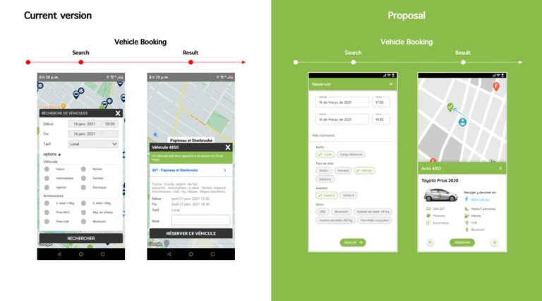
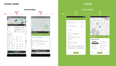
Vehicle Booking
Before: Cluttered map, minimal filters, no availability guidance
After: Clean interface, comprehensive filters, proactive suggestions
Impact: Users found suitable vehicles efficiently without confusion
Key participant feedback
"Much clearer than I expected for a car-sharing app"
"The sign-up felt straightforward and quick"
"I liked knowing what to expect at each step"
Projected Business Impact
Addressing security/waiting concerns could improve sign-up completion toward industry standards (70-80%).
Self-service plan selection with guidance could reduce pricing-related support inquiries.
Proactive alerts and suggestions could increase advance bookings and reduce unavailability frustration.
Spanish validation opens the door to Montreal’s Latin American demographic, as well as those in other major cities.
What I learned
Resourcefulness is a UX skill. Working independently meant relying on public reviews, competitive insights, and user research. You don’t need perfect conditions—just solid validation.
Test early or pay later. The 18% tree-test result hurt, but catching structural issues before visuals saved weeks of rework.
Small samples, strong rigor. With only 11 surveys and 3 interviews, every assumption had to be cross-checked through multiple rounds of testing.
What I Would Do Differently
Since this was an independent project with an 8-week timeline, my focus was showing a systematic approach to problem-solving.
In a real company setting, I would do things differently:
track real users over time to see actual retention results,
test with people who have accessibility needs,
use analytics to measure real conversion improvements,
work closely with stakeholders and developers from the beginning to understand what's technically possible.